Distribution of COVID-19 cases in Cook County

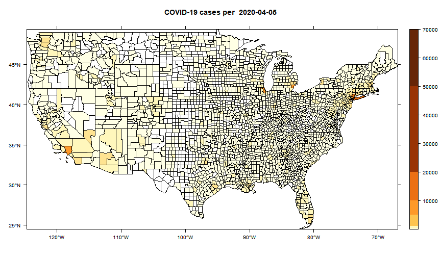
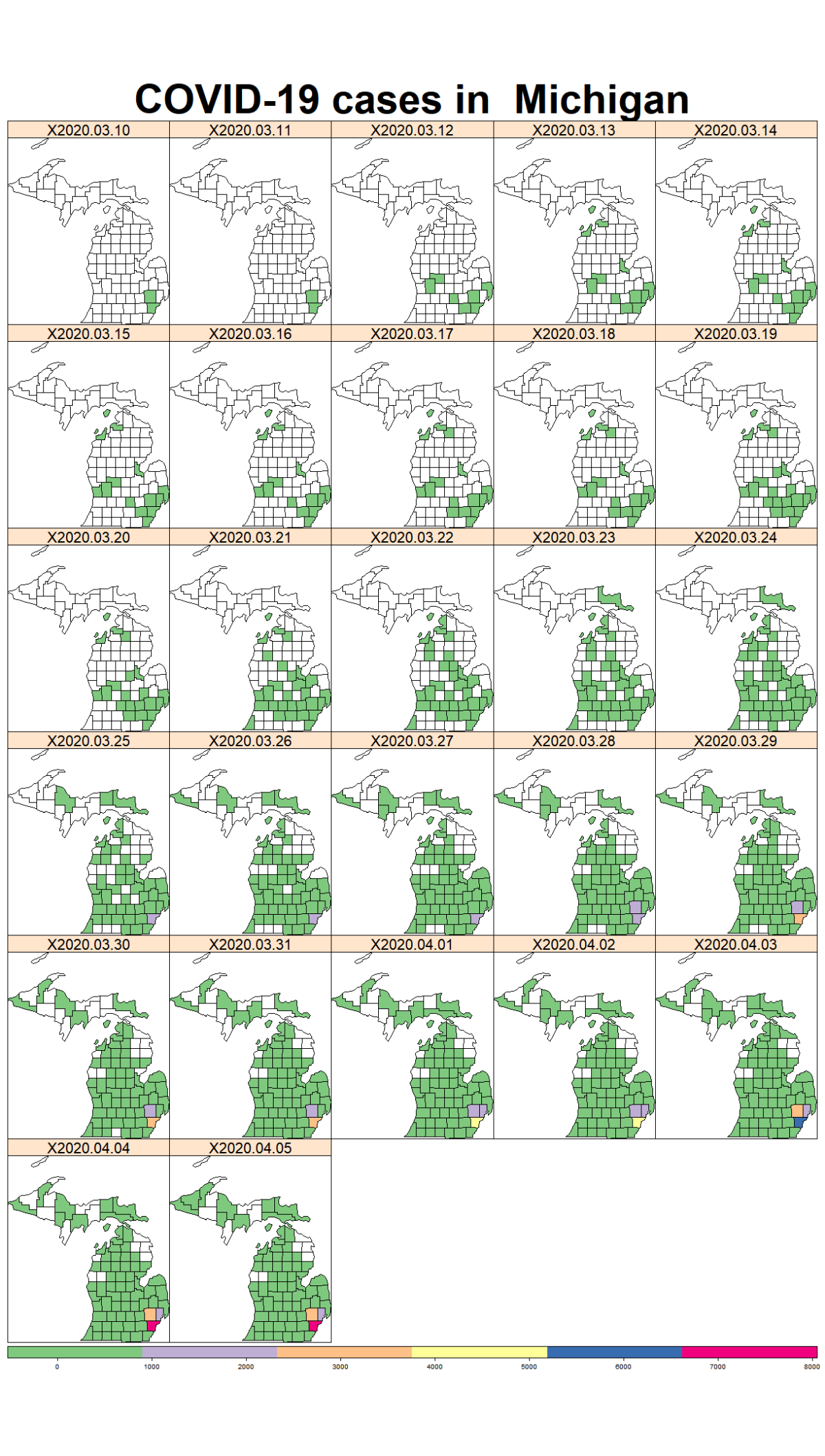
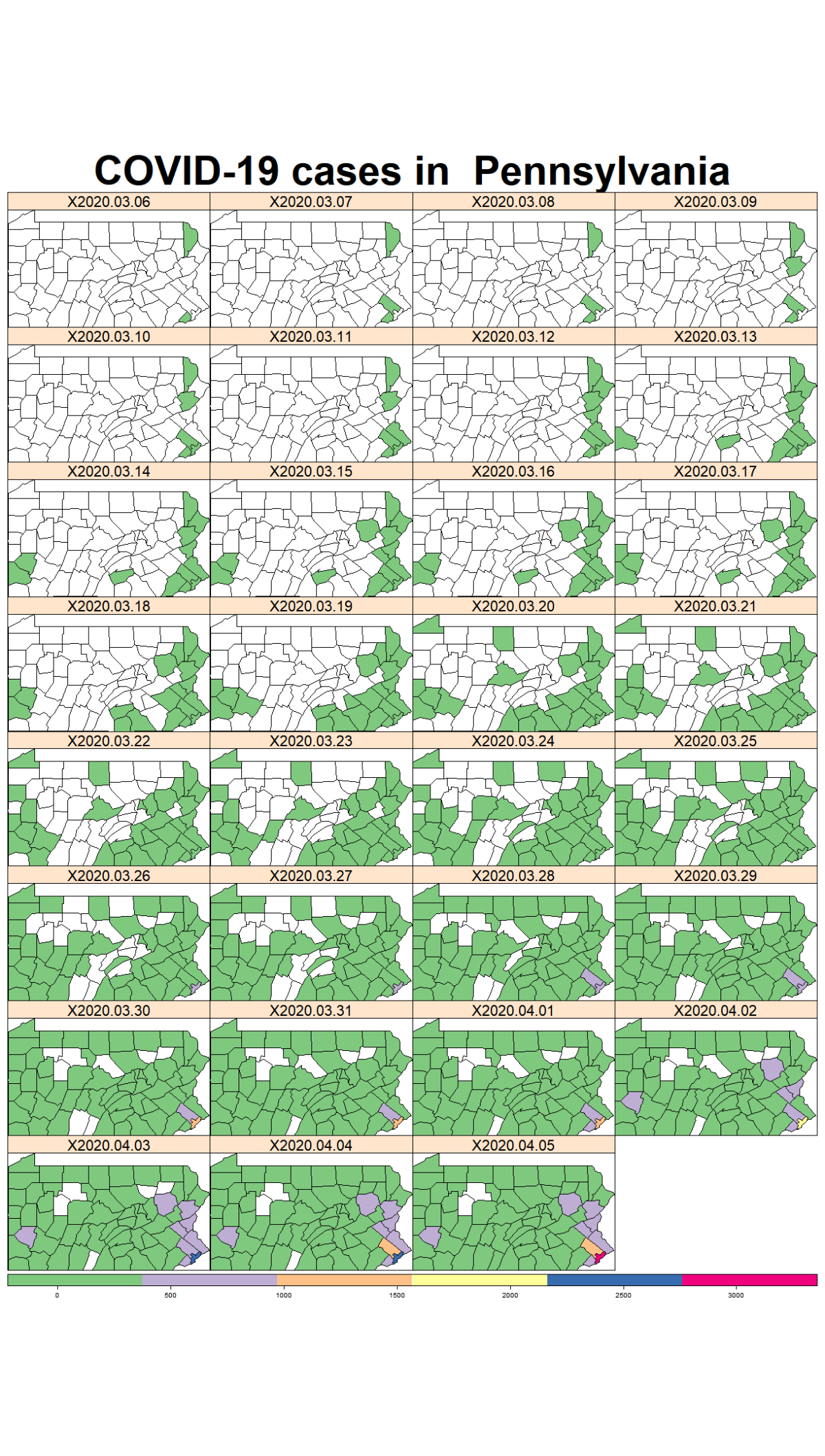
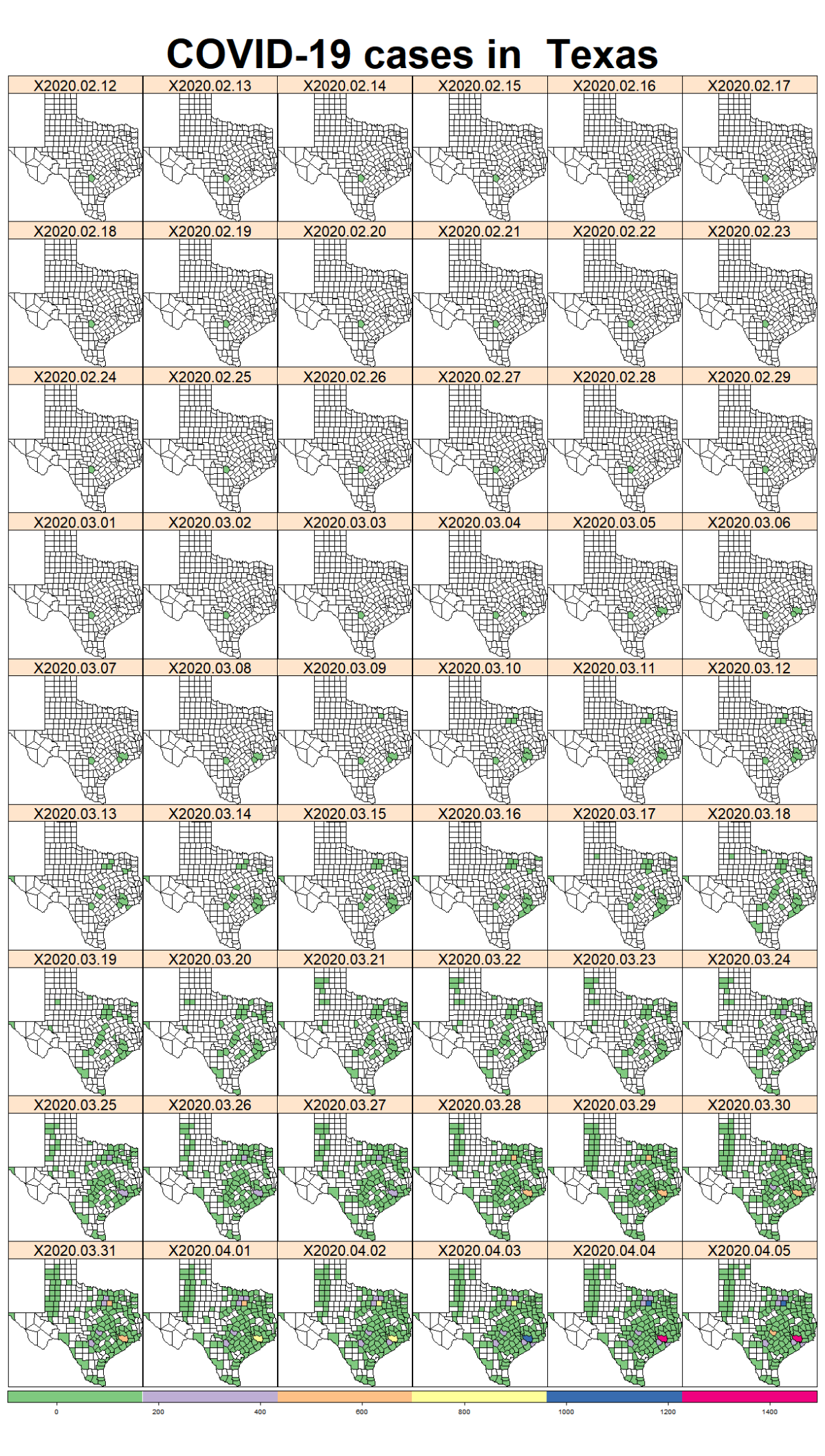
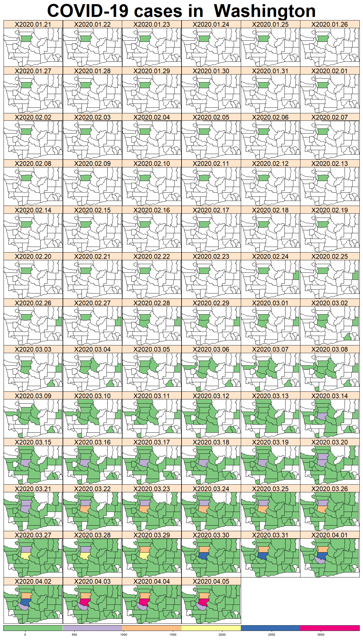
While the majority of states in the U.S. provide COVID-19 county level data, Pennsylvania and Illinois are among few states, as far as I know, that provide COVID-19 data in both county level and zip code level. Pennsylvania provides the number of positive and negative cases per zip code. Illinois provides not only the number of positive and negative cases but also the demographics information (e.g., age composition of positive case, race, and gender distribution) per zip code.

Illinois has more elaborate COVID-19 data. Hence, there are more things to explore with this data. From Illinois data, I want to focus on doing some analysis using zip code level data of Cook County, the most populous county in Illinois. As a former South Side Chicago and Chicago West suburb resident, where both are located in Cook County, I want to know how much COVID-19 impacts Chicago area communities, where I resided for almost 7 years.

My objective is to establish age-adjusted rate of COVID-19 cases by zip code in Cook County.

I am using R to calculate the age-adjusted rate and to visualize the distribution of COVID-19 rate. I want to visualize the distribution of the rates geographically. This allows me to identify which areas are hit harder by COVID-19 from the map.

I collect the data from various sources to do the analysis:

This data in this website is available in JSON format. I extract the data with Python script. I will publish the script anytime in the future.

This shapefile consists of the boundaries of block groups. Since I need the zip code boundaries, I dissolved multiple polygons of block groups with a common zip code into one new zip code polygon. I did this process in QGIS. I know it sounds like too much work to go back and forth between QGIS and R. But, I felt it was easier and faster to do it this way rather than doing it in R.

The ACS data that I downloaded provides and summarizes the data of population for every single census tract in Cook County. It consists of demographic, social, economic, and housing data.

Since I want to calculate the age-adjusted rate, I download the number of population for each age group.

The analysis will be per zip code level, but the number of population from ACS data is available per census tract level. I need to assign each census tract to zip codes. To do this, I use a crosswalk table which makes it possible to allocate census tract to zip codes. So, I join the ACS table with the tract-zip crosswalk table to extract the number of population from ACS table per zip code.

The projected 2010 U.S. population is used as the standard population, with eight groups aged 0 to 19, 20 to 29, 30 to 39, 40 to 49, 50 to 59, 60 to 69, 70 to 79, and 80 years or older.

The R code to work on this analysis is available below.

#------------#
# Libraries  #
#------------#

library(raster)
library(sf)
library(dplyr)
library(ggplot2)
library(RColorBrewer)
library(rgdal)
library(scales)
library(tmap)
library(readxl)
library(ggpubr)
#-------------------#
# Reading the data  #
#-------------------#

## Read Cook County zip code shapefile
cook_zip <- readOGR('.../cook_zip_edit.shp')

cook_zipSF <- st_as_sf(cook_zip)
# qtm(cook_zipSF, fill=NA)

## Read Illinois COVID-19 case per zip code
il_covid <- read.csv(file = '.../covid19_il_2020-05-07.csv')
il_covid$zipcode <- as.factor(il_covid$zip)

## Read Cook County ACS 5 years estimate from 2018
cook_acs <- read_excel('.../ACS5Y2018_IL.xlsx', sheet = 'Sheet1')
cook_acs$tract_new <- as.factor(trim(cook_acs$tract))

## Read Cook County crosswalk table of zip code and tract
crosswalk <- read.csv('.../TRACT_ZIP_122018.csv')
crosswalk$tract_new <- as.factor(crosswalk$tract)
#----------------#
# Joining tables #
#----------------#

## Join shapefile and Cook County IL covid data
cook_covid_zip <- inner_join(cook_zipSF, il_covid, 
                             by = c('ZCTA5CE10' = 'zipcode'))

## alocate the tract to zip code
acs_tract <- inner_join(cook_acs, crosswalk[
  c('tract_new', 'zip', 'res_ratio', 'tract')],
  by = 'tract_new')
### adjusting the number of population with the res_ratio
acs_tract <- acs_tract %>%
  mutate_at(
    c('TotPop', 'TotPopMale', 'TotPop0to19', 'TotPop20to29', 
      'TotPop30to39', 'TotPop40to49', 'TotPop50to59',
      'TotPop60to69', 'TotPop70to79', 'TotPopHE80',
      'TotHH', 'Pop25', 'Pop25Bachelor', 'TotPopForeign',
      'Pop5', 'Pop5Eng', 'Pop5OtherLang', 'PopLabor',
      'PopLaborUnempl', 'Work16', 'Work16Drive',
      'Work16Carpool', 'Work16Public', 'Work16Walk', 
      'Work16Other', 'Work16WFH', 'TotHHSNAP', 'PopCivil',
      'PopCivilInsurance', 'TotHouse', 'TotHouseVacant',
      'TotPopWhite', 'TotPopBlack', 'TotPopAsian',
      'TotPopOther', 'TotPopHisp'),
    funs(Aj = .*res_ratio)
    )

acs_zip <- acs_tract %>%
     group_by(zip) %>%
     summarise_at(c('TotPop_Aj', 'TotPopMale_Aj',
                    'TotPop0to19_Aj', 'TotPop20to29_Aj', 
                    'TotPop30to39_Aj', 'TotPop40to49_Aj',
                    'TotPop50to59_Aj', 'TotPop60to69_Aj',
                    'TotPop70to79_Aj', 'TotPopHE80_Aj',
                    'TotHH_Aj', 'Pop25_Aj', 'Pop25Bachelor_Aj',
                    'TotPopForeign_Aj', 'Pop5_Aj', 'Pop5Eng_Aj',
                    'Pop5OtherLang_Aj', 'PopLabor_Aj',
                    'PopLaborUnempl_Aj', 'Work16_Aj',
                    'Work16Drive_Aj', 'Work16Carpool_Aj',
                    'Work16Public_Aj','Work16Walk_Aj',
                    'Work16Other_Aj', 'Work16WFH_Aj',
                    'TotHHSNAP_Aj', 'PopCivil_Aj',
                    'PopCivilInsurance_Aj','TotHouse_Aj',
                    'TotHouseVacant_Aj', 'TotPopWhite_Aj',
                    'TotPopBlack_Aj', 'TotPopAsian_Aj',
                    'TotPopOther_Aj', 'TotPopHisp_Aj'), sum)
acs_zip$zipcode <- as.factor(acs_zip$zip)


## join acs_zip and covid-19 cases
acs_zip_covid <- inner_join(acs_zip, il_covid, by =c('zipcode'= 'zipcode'))
#--------------------------------------------#
# Create age-adjusted rate of COVID-19 cases #
#--------------------------------------------#

### Age-adjusted rates take into account the age-distribution of a population. 
### Age-adjusted rates are calculated by dividing the number of positive COVID-19 cases 
### by the ACS estimated population in that zip code and age group, 
### then age-adjusting to the 2010 U.S. Census, and multiplying by 10,000.

### age-adjusted 0-19 yr
acs_zip_covid$crude_0to19 <- (acs_zip_covid$ageLT20/acs_zip_covid$TotPop0to19_Aj)*10000
acs_zip_covid$crude_weight_0to19 <- (acs_zip_covid$ageLT20/acs_zip_covid$TotPop0to19_Aj)*
  ((20201362+20348657+20677194+22040343)/308745538)*10000

### age-adjusted 20-29 yr
acs_zip_covid$crude_20to29 <- (acs_zip_covid$age20_29/acs_zip_covid$TotPop20to29_Aj)*10000
acs_zip_covid$crude_weight_20to29 <- (acs_zip_covid$age20_29/acs_zip_covid$TotPop20to29_Aj)*
  ((21585999+21101849)/308745538)*10000

### age-adjusted 30-39 yr
acs_zip_covid$crude_30to39 <- (acs_zip_covid$age30_39/acs_zip_covid$TotPop30to39_Aj)*10000
acs_zip_covid$crude_weight_30to39 <- (acs_zip_covid$age30_39/acs_zip_covid$TotPop30to39_Aj)*
  ((19962099+20179642)/308745538)*10000

### age-adjusted 40-49 yr
acs_zip_covid$crude_40to49 <- (acs_zip_covid$age40_49/acs_zip_covid$TotPop40to49_Aj)*10000
acs_zip_covid$crude_weight_40to49 <- (acs_zip_covid$age40_49/acs_zip_covid$TotPop40to49_Aj)*
  ((20890964+22708591)/308745538)*10000

### age-adjusted 50-59 yr
acs_zip_covid$crude_50to59 <- (acs_zip_covid$age50_59/acs_zip_covid$TotPop50to59_Aj)*10000
acs_zip_covid$crude_weight_50to59 <- (acs_zip_covid$age50_59/acs_zip_covid$TotPop50to59_Aj)*
  ((22298125+19664805)/308745538)*10000

### age-adjusted 60-69 yr
acs_zip_covid$crude_60to69 <- (acs_zip_covid$age60_69/acs_zip_covid$TotPop60to69_Aj)*10000
acs_zip_covid$crude_weight_60to69 <- (acs_zip_covid$age60_69/acs_zip_covid$TotPop60to69_Aj)*
  ((16817924+12435263 )/308745538)*10000

### age-adjusted 70-79 yr
acs_zip_covid$crude_70to79 <- (acs_zip_covid$age70_79/acs_zip_covid$TotPop70to79_Aj)*10000
acs_zip_covid$crude_weight_70to79 <- (acs_zip_covid$age70_79/acs_zip_covid$TotPop70to79_Aj)*
  ((9278166+7317795 )/308745538)*10000

### age-adjusted 80+ yr
acs_zip_covid$crude_HE80 <- (acs_zip_covid$ageHT80/acs_zip_covid$TotPopHE80_Aj)*10000
acs_zip_covid$crude_weight_HE80 <- (acs_zip_covid$ageHT80/acs_zip_covid$TotPopHE80_Aj)*
  ((5743327+3620459+1448366+371244+53364)/308745538)*10000

### Replacing NaN with 0 so crude and age adjusted rate column do not contain NaN.
### (This happens because the number of cases in certain age = 0 
### and number of population of certain age = 0)
acs_zip_covid$crude_HE80[is.nan(acs_zip_covid$crude_HE80)] <- 0
acs_zip_covid$crude_weight_HE80[is.nan(acs_zip_covid$crude_weight_HE80)] <- 0

### Calulate the crude rate
acs_zip_covid$crude_rate <-  acs_zip_covid$crude_0to19 +
  acs_zip_covid$crude_20to29 + acs_zip_covid$crude_30to39 +
  acs_zip_covid$crude_40to49 + acs_zip_covid$crude_50to59 +
  acs_zip_covid$crude_60to69 + acs_zip_covid$crude_70to79 +
  acs_zip_covid$crude_HE80

### Calculate the Age-adjusted rate of COVID-19
acs_zip_covid$age_adjusted_rate <- acs_zip_covid$crude_weight_0to19 +
  acs_zip_covid$crude_weight_20to29 + acs_zip_covid$crude_weight_30to39 +
  acs_zip_covid$crude_weight_40to49 + acs_zip_covid$crude_weight_50to59 +
  acs_zip_covid$crude_weight_60to69 + acs_zip_covid$crude_weight_70to79 +
  acs_zip_covid$crude_weight_HE80


### removing non Cook County IL zip code
acs_zip_covid <- acs_zip_covid %>% filter(
  !zipcode %in% c('60102', '60448', '60491', 
                  '60417', '60423', '60449',
                  '60523', '60126', '60484',
                  '60015', '60521', '60527',
                  '60172', '60118'))


## join shapefile and cases table
zip_case <- inner_join(cook_zipSF, acs_zip_covid, by = c('ZCTA5CE10' = 'zipcode'))
#------------------------#
# Descriptive Statistics #
#------------------------#

## Age distribution of confirmed COVID-19 cases and the population

### Reshaping data from wide to long format
zip_caseSP <- as(zip_case, 'Spatial')
zip_caseSP_df <- zip_caseSP@data
selected_col_df <- zip_caseSP_df[c('zip.x', 'ageLT20', 'age20_29',
                                   'age30_39', 'age40_49', 
                                   'age50_59', 'age60_69', 
                                   'age70_79', 'ageHT80',
                                   'TotPop0to19_Aj', 'TotPop20to29_Aj',
                                   'TotPop30to39_Aj', 'TotPop40to49_Aj',
                                   'TotPop50to59_Aj', 'TotPop60to69_Aj',
                                   'TotPop70to79_Aj', 'TotPopHE80_Aj',
                                   'white', 'black', 'hispanic', 
                                   'asian', 'other', 'NH_PI', 'AI_AN',
                                   'TotPopWhite_Aj', 'TotPopBlack_Aj',
                                   'TotPopHisp_Aj', 'TotPopAsian_Aj',
                                   'TotPopOther_Aj')]

selected_col_df$others <- selected_col_df$other + selected_col_df$NH_PI +
  selected_col_df$AI_AN

agegroup_df <- reshape(data = selected_col_df, 
              idvar = 'zip.x', 
              varying = list(numcase=c('ageLT20', 'age20_29', 
                                       'age30_39', 'age40_49',
                                       'age50_59', 'age60_69',
                                       'age70_79', 'ageHT80'),
                             numpop=c('TotPop0to19_Aj', 'TotPop20to29_Aj',
                                      'TotPop30to39_Aj', 'TotPop40to49_Aj',
                                      'TotPop50to59_Aj', 'TotPop60to69_Aj',
                                      'TotPop70to79_Aj', 'TotPopHE80_Aj')), 
              direction="long", 
              v.names = c("numcase","numpop"),
              times=c('0 to 19', '20 to 29', '30 to 39', '40 to 49',
                      '50 to 59', '60 to 69', '70 to 79', '80+'),
              sep="")

age_summ <- agegroup_df %>% group_by(time) %>% 
  summarise(case = sum(numcase), pop=sum(numpop))
age_summ$pctcase <- age_summ$case*100/(sum(age_summ$case))
age_summ$pctpop <- age_summ$pop*100/sum(age_summ$pop)

p1 <- ggplot(age_summ, aes(x=time, y=pctcase)) +
  geom_bar(stat="identity", fill="thistle2")+
  xlab('Age group') + ylab('%') +
  theme_minimal() +
  ggtitle('Fig 1. Age distribution of COVID-19 cases in Cook County, \nas of May 7, 2020 (%)')

p2 <- ggplot(age_summ, aes(x=time, y=pctpop)) +
  geom_bar(stat="identity", fill="seagreen3")+
  xlab('Age group') + ylab('%') +
  theme_minimal() +
  ggtitle('Fig 2. Age distribution of Cook County population (%)')


ggarrange(p1, p2, 
          ncol = 1, nrow = 2)

plot of chunk unnamed-chunk-5
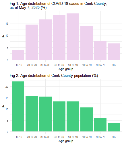
Until May 7, 2020, a total of 47,480 (including 10 cases of unknown age) confirmed cases of COVID-19 occurred in Cook County. As shown in Figure 1, around 18.9% of COVID-19 confirmed cases in Cook County were in their 50s, followed by people in their 40s (18.3%), 30s (16.4%), and 20s (14.3%).

## Race distribution of confirmed COVID-19 cases and the population
race_df <- reshape(data = selected_col_df, 
                   idvar = 'zip.x', 
                   varying = list(numcase=c('white', 'black', 'hispanic',
                                            'asian', 'others'),
                                  numpop=c('TotPopWhite_Aj', 'TotPopBlack_Aj',
                                           'TotPopHisp_Aj', 'TotPopAsian_Aj',
                                           'TotPopOther_Aj')), 
                   direction="long", 
                   v.names = c("numcase","numpop"),
                   times=c('White', 'Black', 'Hispanic', 'Asian', 'Others'),
                   sep="")


race_summ <- race_df %>% group_by(time) %>% summarise(case = sum(numcase), pop=sum(numpop))
race_summ$pctcase <- race_summ$case*100/(sum(race_summ$case))
race_summ$pctpop <- race_summ$pop*100/sum(race_summ$pop)

p3 <- ggplot(race_summ, aes(x=time, y=pctcase)) +
  geom_bar(stat="identity", fill="bisque2")+
  xlab('Race') + ylab('%') +
  theme_minimal() +
  ggtitle('Fig 3. Race distribution of COVID-19 cases in Cook County \nas of May 7, 2020 (%)')

p4 <- ggplot(race_summ, aes(x=time, y=pctpop)) +
  geom_bar(stat="identity", fill="seagreen3")+
  xlab('Race') + ylab('%') +
  theme_minimal() +
  ggtitle('Fig 4. Race distribution of Cook County population (%)')


ggarrange(p3, p4, 
          ncol = 1, nrow = 2)

plot of chunk unnamed-chunk-6

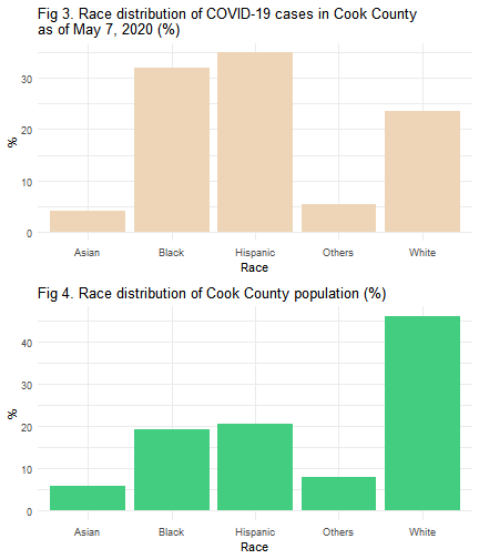
In Figure 4, even though Hispanics make up 20.6% of the Cook County population, they account for 35% of cases and surpass all other race groups in the total number of COVID-19 cases in Cook County, as shown in Figure 3. Meanwhile, black residents make up almost 32% of COVID-19 cases, followed by white residents (23.4%).

There are multiple factors that contribute to the variation of COVID-19 infections among different age group and races. Living arrangement such as larger household size with multiple generations living under the same roof among Hispanic families1,2 may make it more likely that Hispanics are tested positive.

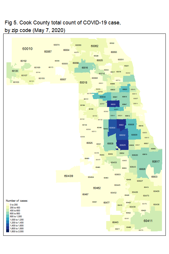
Figure 5 shows the number of cases per zip code across Cook County per May 7, 2020. The lowest and the highest number of cases are 0 and 1,762, respectively. The median number of cases is 178. Some community areas with higher number of cases located in Northwest Side of Chicago, West Side, Southwest Side of Chicago, South Side, and Cicero. The majority of residents in these communities are Hispanic or black.

### number of cases
tm_shape(zip_case) +
  tm_fill('positive',
          title = 'Number of cases:',
          style = 'fixed',
          breaks = seq(0,2000,200),
          palette = 'YlGnBu')+
  tm_layout(legend.title.size = 0.9,
            main.title = 'Fig 5. Cook County total count of COVID-19 case,\nby zip code (May 7, 2020)',
            title.size = 0.9) +
  tm_text('ZCTA5CE10', size='AREA')

plot of chunk unnamed-chunk-7

Almost all disease happen at different rates in different age groups. Some diseases happen more often among elderly and some happen more often among the younger people. To control the effect of differences in population age distributions, the age-adjusted rates3 are calculated. Using age-adjusted rates will make the different groups more comparable because the adjusting minimizes the bias of age.

I employ direct standardization for adjusting. The first step is to divide the number of COVID-19 cases by the ACS estimated population in that zip code. The result of this division is called crude rates. As I use eight age groups (from 0 to 19 to 80 years or older), there will be eight crude rates in total per zip code. Finally, the age-adjusted rate is calculated by multiplying each crude rate by the proportion of U.S. 2010 standard population within each age group, and then summing the products.

Figure 6 and Figure 7 show geographic distribution of COVID-19 crude rate and age-adjusted rate, respectively.

### crude rate
tm_shape(zip_case) +
  tm_fill('crude_rate',
          title = 'Crude rates per \n10,000 people:',
          style = 'fixed',
          breaks = seq(0,2000,200),
          palette = 'BuGn')+
  tm_layout(legend.title.size = 1.2,
            main.title = 'Fig 6. Cook County COVID-19 crude \nrates, by zip code (May 7, 2020)',
            title.size = 0.9) +
  tm_text('ZCTA5CE10', size='AREA')

plot of chunk unnamed-chunk-8

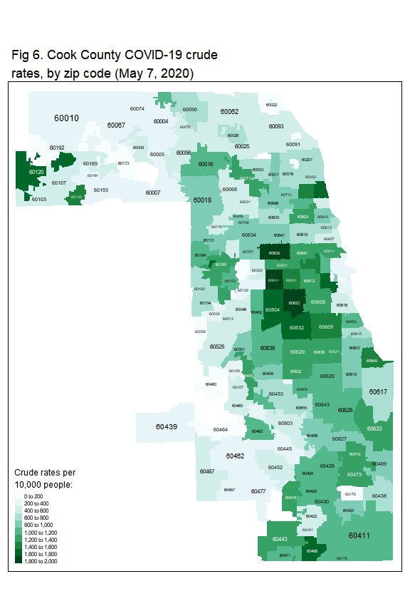
The crude rates range from 0 to 1864 per 10,000 people. After adjusting for age, the rates are now lower than the crude rates.

### age adjusted rate
tm_shape(zip_case) +
  tm_fill('age_adjusted_rate',
          title = 'Age adjusted rates \nper 10,000 people:',
          style = 'fixed',
          breaks = seq(0,250,25),
          palette = 'Reds')+
  tm_layout(legend.title.size = 1.2,
            main.title = 'Fig 7. Cook County COVID-19 age adjusted rates,\nby zip code (May 7, 2020)',
            title.size = 0.9) +
  tm_text('ZCTA5CE10', size='AREA')

plot of chunk unnamed-chunk-9

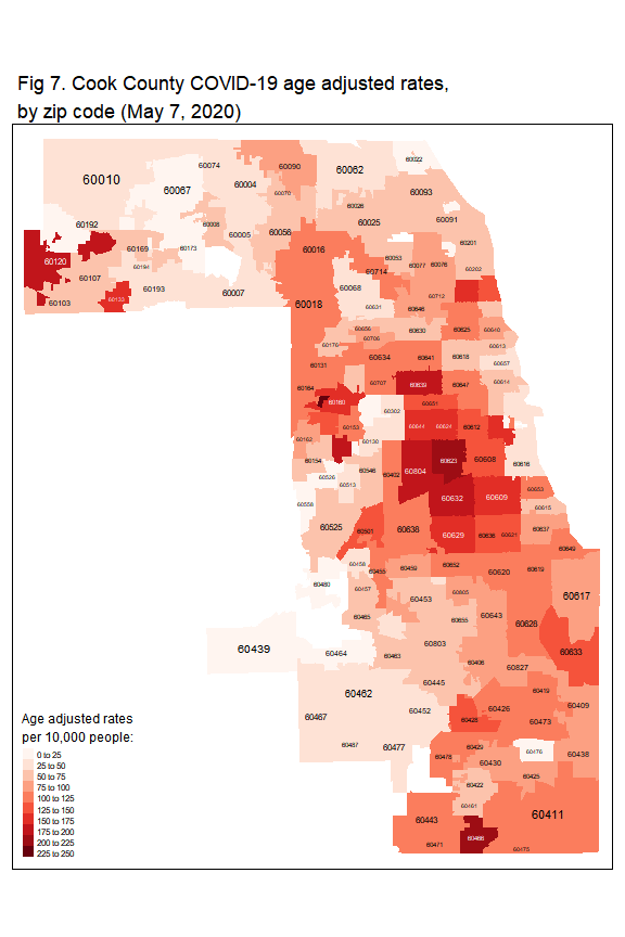
The age-adjusted rates range from 0 to 233 per 10,000 people. In Figure 7, the higher rates in Cook County are concentrated in:

  • City of Chicago. In Chicago, these communities are hit harder by COVID-19: West Side (zip code: 60623, 60608, 60644, and 60624), Northwest side (zip code: 60639), Southwest side
    (zip code: 60629), and South Side (zip code: 60609).
  • West part, i.e., Cicero (zip code: 60804), Stone Park (zip code: 60165), and Broadview (zip code: 60155)
  • Northwest part, i.e., Elgin (zip code: 60120) and Hanover Park (zip code: 60133)
  • South part, i.e., Park Forest (zip code: 60466)

References:
1. Cultural Insights: Communicating with Hispanics/Latinos https://www.cdc.gov/healthcommunication/pdf/audience/audienceinsight_culturalinsights.pdf
2. Illinois Latinos now have highest rate of coronavirus infections, IDPH data shows: https://abc7chicago.com/health/il-latinos-have-highest-rate-of-covid-19-infections-idph-data/6150864/
3. Calculating Age-adjusted Rates: https://seer.cancer.gov/seerstat/tutorials/aarates/definition.html

The spread of COVID-19 in the U.S.

It’s been few weeks since the governor of Pennsylvania and other states placed a stay-at-home order to combat COVID-19 pandemic. Everyone, other than doing essential trip, mostly, stays at home. The life recently has been so unreal. The downtown is no longer vibrant. The world seems like it stops spinning. Only few people to be seen in the street and maintain their distance from each other; jogging, walking their dog, or basically just finishing running errands in the nearby store. I read a substantial amount of COVID-19-related news from all around the world everyday. Substantial enough they could drive me crazy, sad, mad, but also hopeful. In this difficult time, everyone reveals their true colors. Some are ugly, but many are wonderful. Shout out to everyone who take this challenging time as an opportunity to help others. And most importantly, a salute to all front line health care workers who dedicate themselves working many hours of shift, not to mention to work under high risk environment, to treat and cure the sick.

I try to keep myself sane, at home, in the midst of this uncertainty. Besides keeping myself busy with school assignments, I also take this time as an excuse to experimenting new recipes (it doesn’t always go well, though). And, I still keep making tempeh from soybean, too!
There are many institutions which share COVID-19 datasets for public, for example kaggle and New York Times. I jump on the bandwagon to meaningfully play around with COVID-19 public data.

I recently do some descriptive statistics to track the spread of COVID-19 in the U.S. using New York Times dataset. The spread of COVID-19 is very rapid and I am interested to understand its growth from time to time. I describe the spread of COVID-19 using U.S. County-Level map.

Preparing the data

I use R programming language to help me working with the U.S. COVID-19 cases and deaths data. All codes are made available in this post.

First, I install relevant packages, including packages to make it possible to post a blog in WordPress.

if (!require('knitr')) {
  install.packages("knitr")
}
if (!require('devtools')) {
  install.packages("devtools")
}
if (!require('RWordPress')) {
  devtools::install_github(c("duncantl/XMLRPC", "duncantl/RWordPress"))
}
if (!require('raster')) {
  install.packages("raster")
}
if (!require('sf')) {
  install.packages("sf")
}
if (!require('dplyr')) {
  install.packages("dplyr")
}
if (!require('ggplot2')) {
  install.packages("ggplot2")
}
if (!require('RColorBrewer')) {
  install.packages("RColorBrewer")
}
if (!require('rgdal')) {
  install.packages("rgdal")
}

The code below is the code to get the installed libraries and to populate the functions I created. I prefer to populate the functions at the beginning of the script.

#------------#
# Libraries  #
#------------#

library(raster)
library(sf)
library(dplyr)
library(ggplot2)
library(RColorBrewer)
library(rgdal)
#------------#
# Functions  #
#------------#

## Functions to count digit
nDigits <- function(x) nchar( trunc( abs(x) ) )

## Function to create table per state consists of cases number in a particular date in the counties
state_per_date <- function(statecode, whatdate){
  d1 <- as(left_join(county_mainland %>% filter(state_code == statecode), 
                     (covid19_case %>% filter(date == whatdate)), 
                     by = c('state_code' = 'state_code', 'county_code' = 'county_code')), 'Spatial')
  d1$date[is.na(d1$date)] <- whatdate
  d2 <- st_as_sf(d1)
  d3 <- d2[c('state', 'state_code', 'county_code', 'cases', 'deaths')]
  d4 <- st_set_geometry(d3, NULL) # remove geometry column
  return(d4)
}


## Function to:
## 1) adding columns to table. These columns represent each date in the state with reported case 
## 2) creating maps visualizing the number of cases from day to day in a state
state_per_date_map <- function(statecode, statename){
  df_geom <- unique(county_mainland[c('state_code', 'county_code', 'NAME')] %>% 
                      filter(state_code == statecode))
  for (i in unique((covid19_case %>% filter(state_code == statecode))$date)){
    date_tbl <- state_per_date(statecode, i)
    df_geom$state_name <- date_tbl$state
    df_geom[[i]] <- date_tbl$cases
  }
  df_geomSP <- as(df_geom, 'Spatial')
  date_list <- colnames(df_geomSP@data[,5:(length(unique((covid19_case %>% 
                                                            filter(state_code ==
                                                                     statecode))$date))+4)])
  spplot(df_geomSP, date_list, do.log=TRUE,
         colorkey=list(space="bottom"),
         main = list(label = paste('COVID-19 cases in ', statename), cex = 5),
         as.table =TRUE,
         # cex = .5,
         par.strip.text=list(cex=1.8),
         col.regions=brewer.pal(6, "Accent"),
         cuts = 5)
}

## Function to generate maps that visualize the U.s. confirmed case
us_case <- function(whatdate){
  spplot(as(left_join(county_mainland, (covid19_case %>% filter(date == whatdate)), 
                      by = c('state_code' = 'state_code', 'county_code' = 'county_code')), 'Spatial'),
         'cases', col.regions=brewer.pal(9, "YlOrBr"), at = c(1,100, 1000, 5000, 10000,
                                                                20000, 50000, 70000),
         scales=list(draw=T),
         main = paste('COVID-19 cases per ',  whatdate))
}

Getting the data ready!

Note that there are some geographical caveats in the reported cases and deaths data from New York Times dataset. This information could be found under ‘Geographic Exceptions’ in New York Times COVID-19 data Github page. Hence, I make few adjustments in the data cleaning process.

For this purpose, I only include the states in U.S. mainland and remove Alaska, Hawaii, American Samoa, Guam, Northern Mariana Islands, Puerto Rico, and Virgin Islands from the analysis. The COVID-19 reported cases and deaths data that I use is up to April 5th, 2020.

#------------------#
# Getting the data #
#------------------#

## COVID-19 data
covid19_case <- read.delim(file = ".../covid19.txt", 
                           header = TRUE, sep = ',')

## the U.S. county shapefile
county_shp <- shapefile('.../cb_2018_us_county_20m.shp')
### Converting shp to simple feature object
county_shpSF <- st_as_sf(county_shp)
### Focusing only to the U.S. mainland and removing Alaska, Hawaii, American Samoa, Guam, 
### Northern Mariana Islands, Puerto Rico, and Virgin Islands from the analysis  
county_mainland <- county_shpSF %>% filter(!STATEFP %in% c('02', '15', '60', '66', '69', '72', '78'))
#------------------#
# Data cleaning    #
#------------------#

## Creating state code and county code
### Converting state code and county code to integer.
### Five counties in New York are populated as one 'New York City'. 'New York City' is currently
### has no county code. I assign 'New York City' county code 999. And I assign the same county code
### for the five counties.
county_mainland$state_code <- as.numeric(as.character(county_mainland$STATEFP))
county_mainland$county_code <- ifelse(county_mainland$STATEFP == '36' & 
                                        county_mainland$NAME %in% c('New York', 'Kings',
                                                                    'Queens', 'Bronx', 'Richmond'),
                                      999,  as.numeric(as.character(county_mainland$COUNTYFP)))

### Extracting the state code and the county code from fips in COVID-19 data
covid19_case$state_code <- ifelse(covid19_case$state == 'New York', 36, 
                                  ifelse(nDigits(covid19_case$fips) == 4,
                                         as.numeric(substr(covid19_case$fips, 1, 1)),
                                                 as.numeric(substr(covid19_case$fips, 1, 2))))
covid19_case$county_code <- ifelse(covid19_case$county == 'New York City', 999,
                                   as.numeric(substr(covid19_case$fips, nchar(covid19_case$fips) - 3
                                                     + 1, nchar(covid19_case$fips))))
### Including only states in mainland
covid19_case <- covid19_case %>% filter(!state_code %in% c(2, 15, 60, 66, 69, 72, 78))

## Joining COVID-19 case data with County shapefile
county_case <- left_join(county_mainland, covid19_case, by = c('state_code' = 'state_code', 'county_code' = 'county_code'))

Summarizing COVID-19 cases and deaths

The script to summarize COVID-19 cases and deaths in the U.S. is here:

#------------------------#
# Descriptive statistics #
#------------------------#

## Number of cumulative cases in the U.S. from time to time
case_date<- covid19_case %>% group_by(Date = as.Date(date)) %>% 
                  summarise(case_number = sum(cases, na.rm=TRUE))

ggplot(case_date, aes(x=Date, y=case_number)) + 
  geom_line(colour = '#408FA6') +
  geom_point(colour = '#408FA6') + 
  labs(title = 'Total cases of COVID-19 in the U.S.') +
  labs(x = 'Date') +
  labs(y = 'Number of cases') +
  theme_minimal()

plot of chunk unnamed-chunk-5

## Number of cumulative death in the U.S. from time to time
death_date<- covid19_case %>% group_by(Date = as.Date(date)) %>% 
  summarise(death_number = sum(deaths, na.rm=TRUE))

ggplot(death_date, aes(x=Date, y=death_number)) + 
  geom_line(colour = 'purple') +
  geom_point(colour = 'purple') + 
  labs(title = 'Total death due to COVID-19 in the U.S.') +
  labs(x = 'Date') +
  labs(y = 'Number of cases') +
  theme_minimal()

plot of chunk unnamed-chunk-5

## Visualizing the number of cases in the U.S. in specific dates.

us_case('2020-03-09')

plot of chunk unnamed-chunk-6

us_case('2020-03-18')
## Error in UseMethod("depth"): no applicable method for 'depth' applied to an object of class "NULL"
us_case('2020-03-26')

plot of chunk unnamed-chunk-8

us_case('2020-04-05')

plot of chunk unnamed-chunk-9

From time to time, until the beginning of April 2020, the number of reported COVID-19 cases grows in many areas, in a matter of just four weeks, as indicated by more orange colors from the maps above. But, the counties where New York City, Seattle, Los Angeles, Chicago, Detroit, and Miami are located, are hit harder by a higher increasing number of COVID-19 cases.

I try to take a closer look at the number of cases and deaths per state. Using line chart, I want to identify the growth of the number of cases from time to time for each state, as seen below. The red line represents number of cases, the blue line represents number of deaths..

## Number of cumulative cases and death per state
state_case <- covid19_case %>% group_by(state, Date = as.Date(date)) %>%
            summarise(number = sum(cases, na.rm=TRUE), status = 'case')
state_death <- covid19_case %>% group_by(state, Date = as.Date(date)) %>%
  summarise(number = sum(deaths, na.rm=TRUE), status = 'death')
state_all <- rbind(state_case, state_death)

ggplot(data = state_all %>% filter(!state %in% c('Alaska', 'Hawaii', 'American Samoa', 'Guam', 
'Northern Mariana Islands', 'Puerto Rico', 'Virgin Islands')), mapping = aes(x = Date, y = number, color = status)) +
  geom_line(size =1) + facet_wrap(facets = vars(state)) +
  theme_bw() +
  ggtitle("Total cases and death of COVID-19 in each state") +
  theme(strip.text = element_text(size = 20),
        plot.title = element_text(size = 40))

plot of chunk unnamed-chunk-10

The spread of COVID-19 in selected states

Based on the line chart above, I want to further explore the spread of COVID-19 in the states showing a trajectory of increasing cases. These states are California, Colorado, Florida, Illinois, Louisiana, Massachusetts, Michigan, New Jersey, New York, Pennyslvania, Texas, and Washington. The number of cases is visualized from the first day the state reporting the case.

## California
state_per_date_map(6, 'California')

plot of chunk Fig1

## Colorado
state_per_date_map(8, 'Colorado')

plot of chunk Fig2

## Florida
state_per_date_map(12, 'Florida')

plot of chunk unnamed-chunk-11

## Illinois
state_per_date_map(17, 'Illinois')

plot of chunk unnamed-chunk-12

## Louisiana
state_per_date_map(22, 'Louisiana')

plot of chunk unnamed-chunk-13

## Massachusetts
state_per_date_map(25, 'Massachusetts')

plot of chunk unnamed-chunk-14

## Michigan
state_per_date_map(26, 'Michigan')

plot of chunk unnamed-chunk-15

## New Jersey
state_per_date_map(34, 'New Jersey')

plot of chunk unnamed-chunk-16

## New York
state_per_date_map(36, 'New York')

plot of chunk unnamed-chunk-17

## Pennyslvania
state_per_date_map(42, 'Pennsylvania')

plot of chunk unnamed-chunk-18

## Texas
state_per_date_map(48, 'Texas')

plot of chunk unnamed-chunk-19

## Washington
state_per_date_map(53, 'Washington')

plot of chunk unnamed-chunk-20

As can be seen above that the cases started in one or two counties only but it grows rapidly that the cases are almost in every county in the state by the end of March. In general, metropolitan area, for example, New York City, Philadelphia, Chicago, and Los Angeles, are more severe in terms of the number of cases compared to the rural area.

Among the selected states, New York has the most cases of COVID-19. The New York metropolitan area is hit the hardest. New York has reported more than 60,000 COVID-19 cases until April 5th since its first case was confirmed on March 1.

I am interested to identify the percent growth of cases compared to the previous day. This would provide an in-depth insight when the number of cases is way higher or way lower than the day before. The percent growth of new cases for the selected states is shown below. Note that this only reports the percent growth on the days when the number of cases in the state starts to reach 100 or more.

per_date <- covid19_case %>% filter(state %in% c('California', 'Colorado', 'Florida', 'Illinois', 
                                                 'Louisiana', 'Massachusetts', 'Michigan', 'New Jersey', 
                                                 'New York', 'Pennsylvania', 'Texas', 'Washington')) %>% 
  group_by(state, Date = as.Date(date)) %>% summarise(case_num = sum(cases, na.rm=T))

per_date_diff <- per_date %>% group_by(state) %>% filter(case_num >= 100) %>%
  arrange(Date) %>% mutate(pct_change_case = ((case_num - lag(case_num))/ lag(case_num)) * 100)

ggplot(per_date_diff, aes(x=Date, y=pct_change_case, size=0.2)) + geom_line() + 
  labs(x = 'Date') +
  labs(y = '% difference') +
  geom_line(colour = '#408FA6') +
  # scale_x_date(breaks = per_date_diff$Date) +
  facet_wrap(~state) +
  ggtitle("Percent growth of new cases compared to previous day") +
  theme(text = element_text(size=20),
        strip.text = element_text(size = 20),
        legend.position = 'none') 

plot of chunk unnamed-chunk-21

Based on chart above, Illinois, Michigan, New York, and New Jersey are among the states that experience the highest percent increase of new cases compared to the previous day, ranging from 64% to 79%, in around March 18 to March 20.

The lowest percent increase of new cases, 2.5%, occurs in Washington on March 31st. The following days, the percent increase of new cases in Washington are always less than 11% until April 5th. California also experiences low percent increase of new cases, 4%, on March 10th, three weeks after it confirmed the first case on January 25th. But, the next day the percentage increased by 12%.

In the future, I’d like to explore the relationship between the case of COVID-19 and various factors, e.g., population density, age composition, poverty, literacy, and high-risk conditions (smoking rate, asthma rate, and obesity) at the county level, particularly in the states affected the most by this pandemic.

Anyway, this is my first post to WordPress using RMarkdown. I was so thrilled being able to run R script to post this one! As I am the new kid on the block in this WordPress-RMarkdown universe, so I’ve anticipated a learning curve. Please reach out to me to share helpful tips for posting code and output using RMarkdown in the comment!

Stay safe, stay home, and practice physical distancing!